Lifeline Australia
Thinkerbell
2025
Art direction
Design
Branding
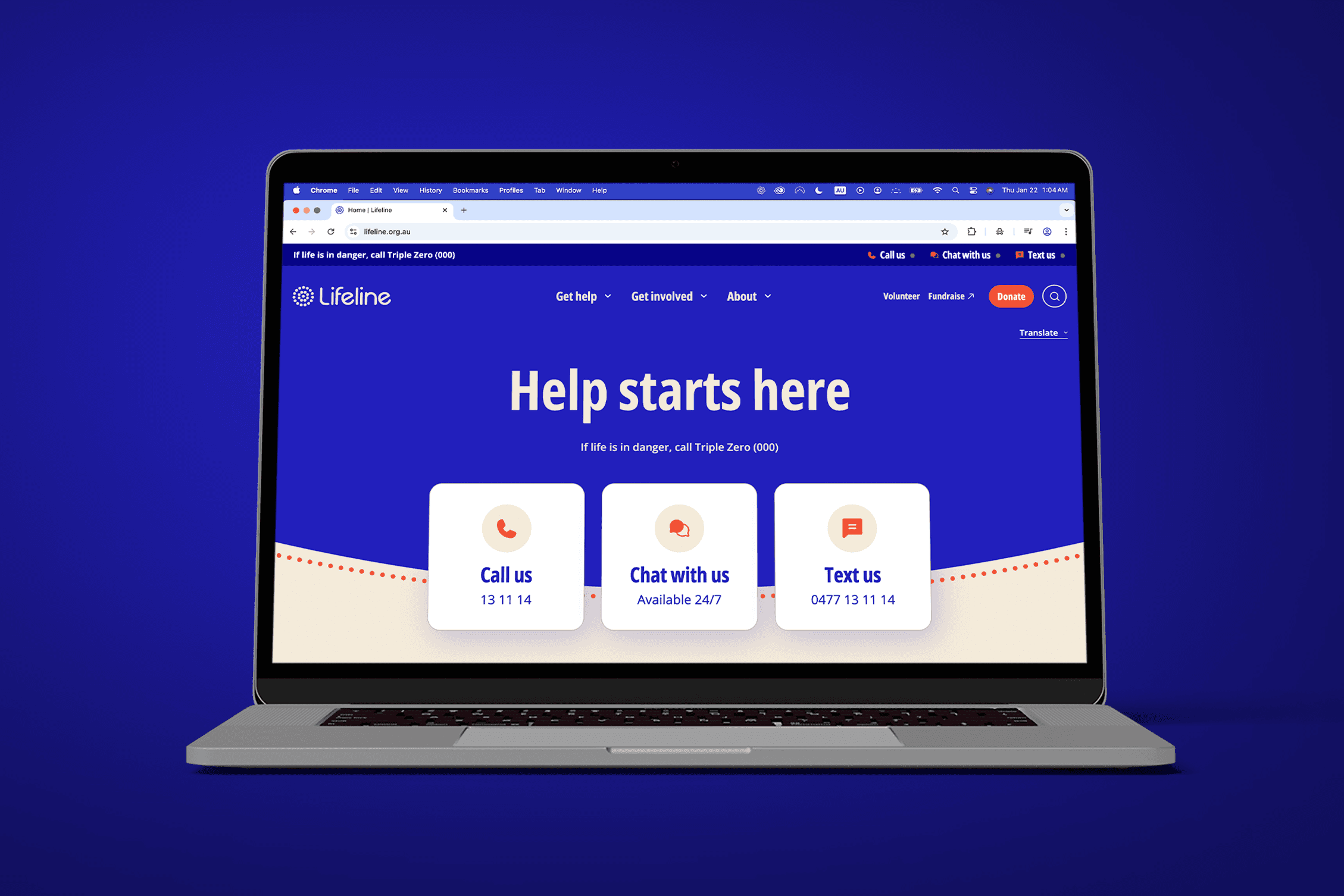
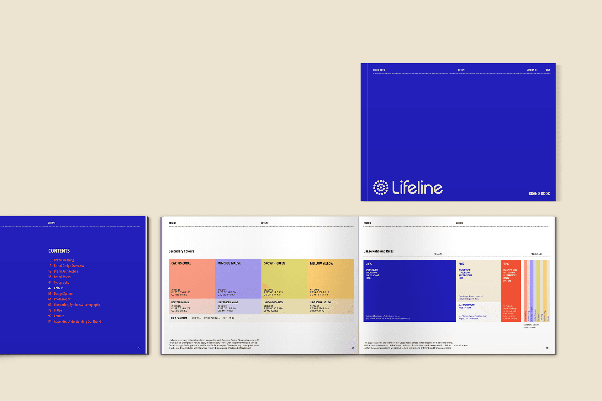
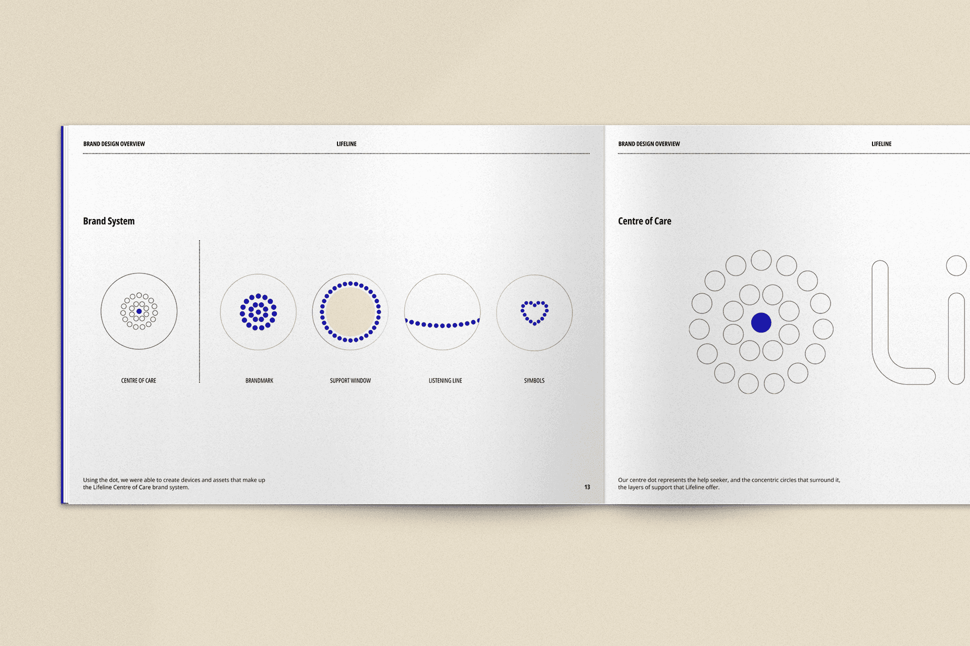
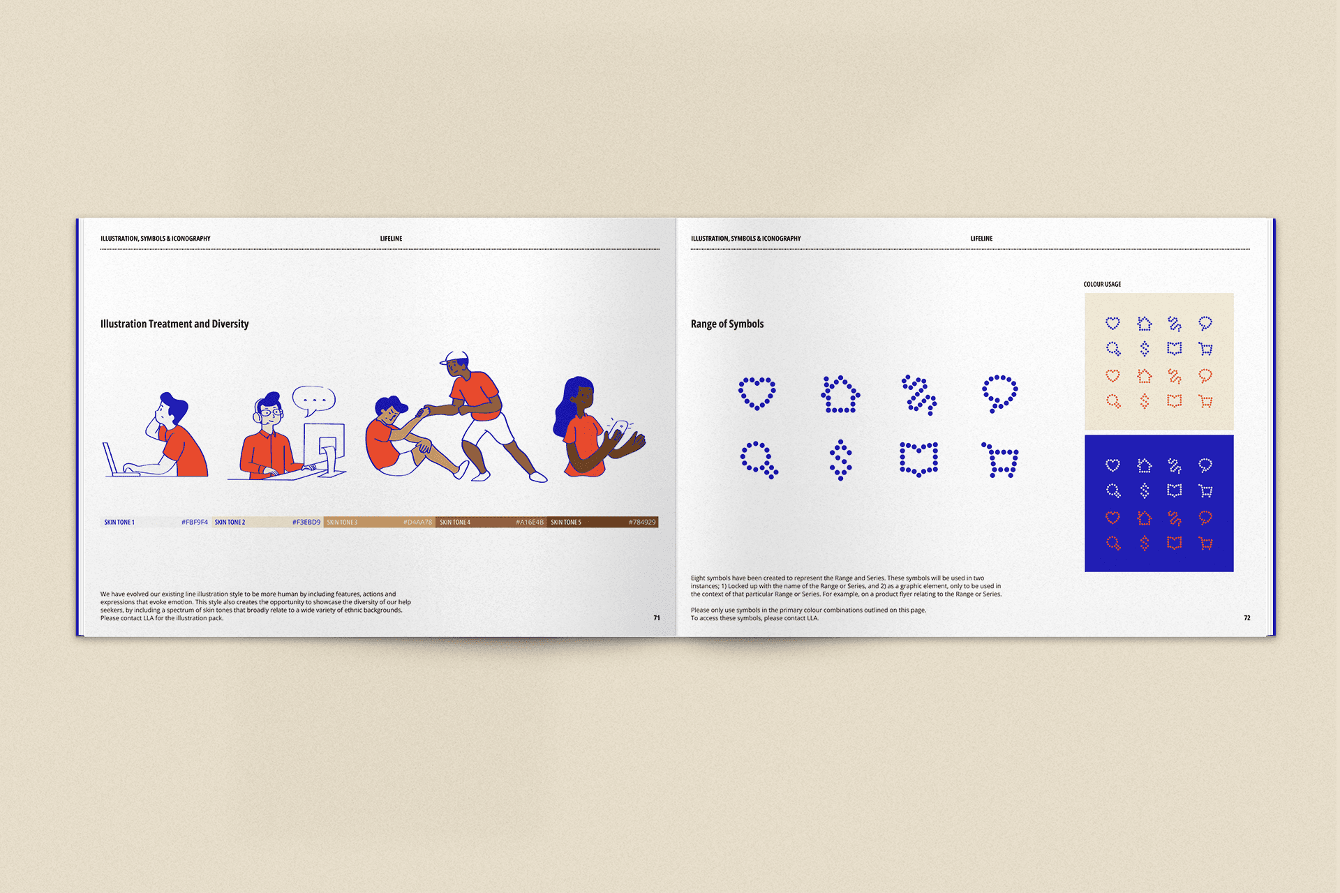
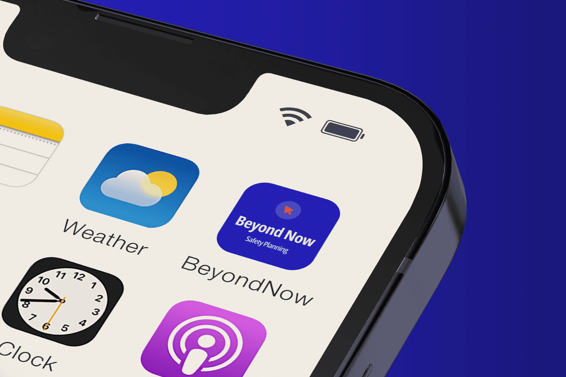
We delivered a brand refresh for Lifeline Australia and produced comprehensive brand guidelines. We developed a new design system centered around their iconic logo, built to work consistently across website, OOH, print, and digital channels. This included refreshed photography, new illustrations and an icon set, plus clear layout guides for OOH, print, and digital so teams can apply the system quickly and reliably across many formats. The system is currently being rolled out across 250+ locations nationwide.